Data Visualization with Tableau
Friday, 8 November 2019, at the E-4 iSTTS Building, the 4th Knowledge Sharing Program (KSP) seminar with the theme "How to Visualize Your Data Easily" was delivered by one of the Informatics lecturers at iSTTS, Mr. Hendrawan A., S .Kom., M.Kom. This time, KSP gave all participants the opportunity to get to know the Tableau application, a software that helps management accelerate decision making based on data visualization. According to Mr. Hendrawan, the Tableau application is one of the most widely used applications for visualizing data and is user friendly.
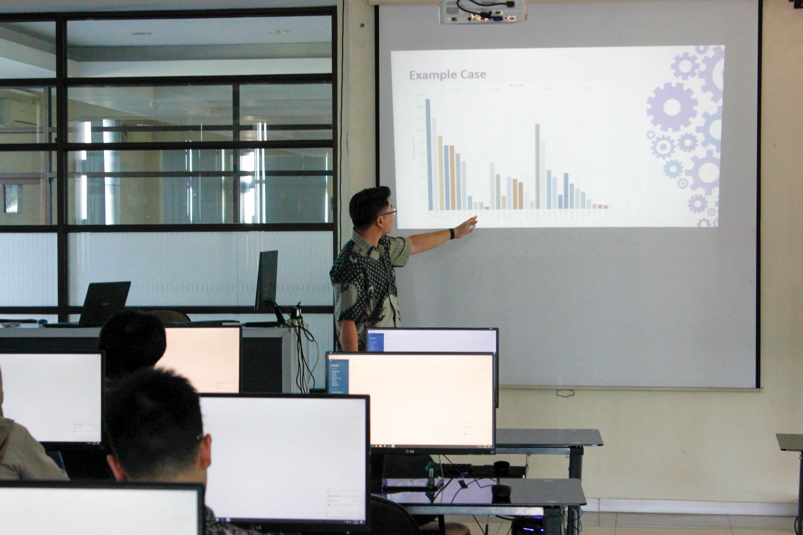
"A small group of data can be processed using the sorting method to draw a conclusion. On the other hand, large amounts of data will be easier if it is displayed in graphical form or visualization which is more interesting and simple without sorting," said Mr. Hendrawan while standing in front of dozens of students. present. According to him, just by visualizing, people's understanding will reach 50% - 70%. In visualizing data, TABLEAU offers many tools, including Tableau, Qlik, Plotly, Excel, and Sisense. However, TABLEAU itself is level 1 visualization and is paid. If the learning version is used, a free trial is available for a certain period. Users can claim the free trial again if they register with the learning version where in TABLEAU everything is drag and drop.
In displaying data, you should convey something that is clear and related to something that is intended. Up to now, visualization learning at iSTTS is discussed in the Big Data course taught in the Informatics and Information Systems department. So, what is the main reason a group of data needs to be visualized? Data visualization is commonly used as a guide so that decision making can be done quickly and accurately in the business world.